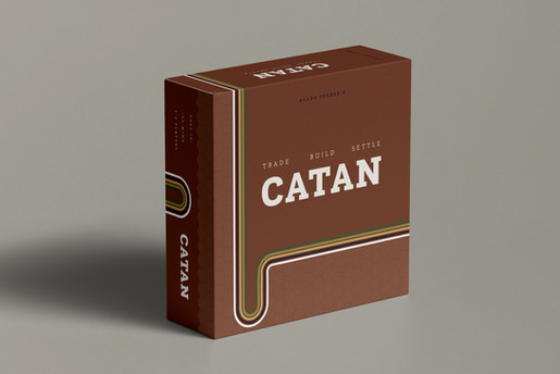
catan redesign
curated a redesigned, updated look for the popular game, Catan
Already capturing a classic look, I decided to pull the retro aesthetic even further into a version, pairing antiques with minimalism. Being a big fan of the game myself, I enjoyed getting to explore this design challenge.
I am interested in product and packaging design. For the packaging design piece, I looked at the original box (no problem, since I have one right in my living room). I began with the idea of updating the design in place; I focused on hills, layering updated colors and minimalist, monochromatic patterns for each color.

I was also intrigued by the classic hexagon motif throughout the game. I took this shape and sketched ideas of how to incorporate those shapes onto the cover box, rather than depicting a scene.
From these ideas, I further refined my modern design. I decided on the minimalist, repeated curved lines theme, painting the new colors across the box. The lines would remind players of the resources one wants to gather: wool, grain, lumber, brick, and ore. They would also direct a viewer's eye from the title, to the game creator, to opening the box.


